Snowflake : ON/OFF switch
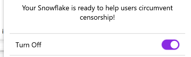
The ON/OFF switch is not user friendly, Maybe change the "Turn on" by "State : off" & "Turn off" by "State : on" ? Or just setup a static string with "State" ?
Thanks G.
Activity

Replying to cypherpunks:
When the switch is enabled, I expect to read "ON" and not "(turn) OFF". It can be confusing :/
Thanks for the input cypherpunks!
I'd like to get antonela's feedback on this. I'm worried that terminology like "State" makes more sense with a computer science background and can be confusing for users unfamiliar with coding or things like state machines.
I can see your point on how it could be more immediately clear to see simply "ON" or "OFF" with a toggle that changes it, but I don't have a background in UX. Are the other visual indicators (colour of snowflake, additional text above the toggle) useful?

Major design systems recommend avoiding using OFF/ON in the switcher since the UI component already reflects that status, especially for preventing this kind of confusion.
We can use a label that doesn't describe the values of a switch: what if we use
Statusor something close to it?https://material.io/components/selection-controls/#switches https://developer.apple.com/design/human-interface-guidelines/ios/controls/switches/

Replying to antonela:
Major design systems recommend avoiding using OFF/ON in the switcher since the UI component already reflects that status, especially for preventing this kind of confusion.
We can use a label that doesn't describe the values of a switch: what if we use
Statusor something close to it?https://material.io/components/selection-controls/#switches https://developer.apple.com/design/human-interface-guidelines/ios/controls/switches/
Status would be perfect
Trac:
Username: IPv7
Here's a patch that switches to using a static label, "Enabled"
https://github.com/keroserene/snowflake/commit/a9d7cb6f9384121c842ea68bf64731801be03564
I went with that because on
chrome://extensions/the toggles there havearia-label="Extension Enabled", but I found the "Extension" part redundant.Trac:
Status: new to needs_reviewReplying to arlolra:
Here's a patch that switches to using a static label, "Enabled"
https://github.com/keroserene/snowflake/commit/a9d7cb6f9384121c842ea68bf64731801be03564
I went with that because on
chrome://extensions/the toggles there havearia-label="Extension Enabled", but I found the "Extension" part redundant.Perfect !

-
I thought we were moving forward with Status.
Sorry, I took a liberty here from when you said, "what if we use Status or something close to it?"
It's a 1-line change at this point. So, happy to make it if you prefer that.