Activity 4.1: Improve how circuits are displayed to the user
Problem we are trying to solve:
Many users expect the guard node to change when asking for a new circuit.
There is nothing on circuit display that tells the user the first node is a guard, what guards are, and how it works when Tor creates new circuits for the user.
Expected behavior
If no other condition, guards will only change for a client every 3 months. Even if the user pick 'new identity' the guard should stay the same.
Proposed solution:
First of all we need to update the Tor Browser User Manual to have an explanation about how the guard selection works, it should be in this section: https://tb-manual.torproject.org/en-US/managing-identities.html
All the solutions below will link to the manual, this will allow us to send the user to a place with more information. And not necessary have to explain everything in the display or UI.
Managing users expectations: I believe that for now we are better served if we managed user expectation about what will change when they request such change, not in the circuit display. The current places where the user will be asking for a new circuit are:
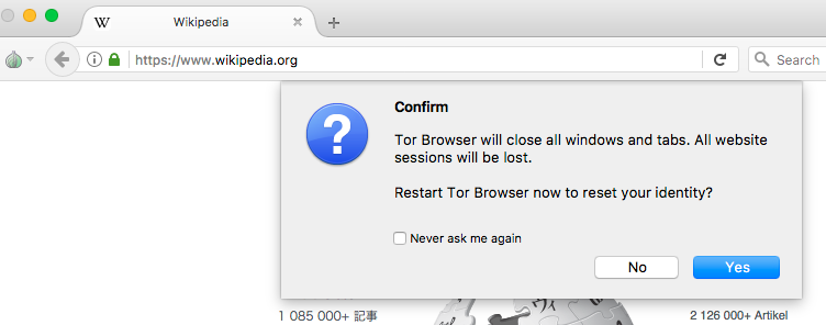
1 - Tor Button -> New Identity At this action, Tor Browser will open a confirmation window (see screenshot: https://trac.torproject.org/projects/tor/attachment/ticket/24309/new_identity_confirmation_window.png) We should change the text here to set the right expectation about guards.
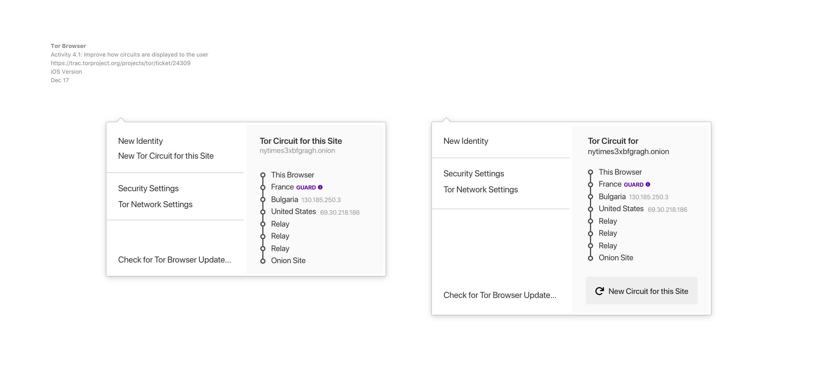
2 - Tor Button -> New Tor Circuit for this Site Could we have a tool tip here that helps user know that guards won't change.
Circuit display UI: keep IP and country name. Add 'guard' to the first node - guard should be a link to manual page. Add a link at the bottom for "Learn More" which should also link to the manual page.
I am suggesting 2 links to the manual as an intentional effort of over communicating to the user.
Things I would like to test
- User understanding of Tor Browser User Manual explanation about how guards selection works.
- Did we managed to set the right expectation for user? Test it with New Identity flow and New Tor Circuit flow.
- Do we need both links on circuit display?
Things I am suggesting to be left for a second iteration or not doing and why
- Suggesting to not add functionality to let user pick a different guard. I think such a feature should be deeply discussed and done as a project of it own. Not as part of this solution.
- Suggestion to leave for a second iteration making the IP addresses linkable to more information about the relay (from atlas).
- Suggestion to not use JS for the more information on the relay feature mentioned above. We should never jeopardize the user safety for 'better UX'. We should be able to deliver better UX within the limitations we have by building a product that has security by design in mind.
Tickets related to the problem:
- Ticket: https://trac.torproject.org/projects/tor/ticket/16665
- Circuit visualizer needs a cue about guards
This is the main ticket that contains lots of information describing the user problem in the comments posted. Would recommend reading it fully for better understanding.
- Ticket: https://trac.torproject.org/projects/tor/ticket/15239
- Add hyperlinks in tor circuit display to show "more info" about relays
This ticket has some suggestions for displaying more information about the relays (using atlas). We are taking into consideration these suggestions in the hypothesis above.
- Ticket: https://trac.torproject.org/projects/tor/ticket/20805
- Circuit display does not honor or use the UI font.
This ticket is more a bug then a UX issue. Although we should make sure that we set a rule of what font to use in the display, and fall back options. Let's make sure we are aligning this with: Activity 1.2: Make sure Firefox Photon UI works with our style guidelines -- on UX Team roadmap (for March 2018)
Activity

Trac:
Description: The UX team will look into the problems described in these tickets:And work on the best way to solve them in Tor Browser circuit display.
to
Problem we are trying to solve:
Many users expect the guard node to change when asking for a new circuit.
There is nothing on circuit display that tells the user the first node is a guard, what guards are, and how it works when Tor creates new circuits for the user.
Expected behavior
If no other condition, guards will only change for a client every 3 months. Even if the user pick 'new identity' the guard should stay the same.
Proposed solution:
First of all we need to update the Tor Browser User Manual to have an explanation about how the guard selection works, it should be in this section: https://tb-manual.torproject.org/en-US/managing-identities.html
All the solutions below will link to the manual, this will allow us to send the user to a place with more information. And not necessary have to explain everything in the display or UI.
Managing users expectations: I believe that for now we are better served if we managed user expectation about what will change when they request such change, not in the circuit display. The current places where the user will be asking for a new circuit are:
1 - Tor Button -> New Identity At this action, Tor Browser will open a confirmation window (see screenshot: ) We should change the text here to set the right expectation about guards.
2 - Tor Button -> New Tor Circuit for this Site Could we have a tool tip here that helps user know that guards won't change.
Circuit display UI: keep IP and country name. Add 'guard' to the first node - guard should be a link to manual page. Add a link at the bottom for "Learn More" which should also link to the manual page.
I am suggesting 2 links to the manual as an intentional effort of over communicating to the user.
Things I would like to test
- User understanding of Tor Browser User Manual explanation about how guards selection works.
- Did we managed to set the right expectation for user? Test it with New Identity flow and New Tor Circuit flow.
- Do we need both links on circuit display?
Things I am suggesting to be left for a second iteration or not doing and why
- Suggesting to not add functionality to let user pick a different guard. I think such a feature should be deeply discussed and done as a project of it own. Not as part of this solution.
- Suggestion to leave for a second iteration making the IP addresses linkable to more information about the relay (from atlas).
- Suggestion to not use JS for the more information on the relay feature mentioned above. We should never jeopardize the user safety for 'better UX'. We should be able to deliver better UX within the limitations we have by building a product that has security by design in mind.
Tickets related to the problem:
- Ticket: https://trac.torproject.org/projects/tor/ticket/16665 ** Circuit visualizer needs a cue about guards
This is the main ticket that contains lots of information describing the user problem in the comments posted. Would recommend reading it fully for better understanding.
- Ticket: https://trac.torproject.org/projects/tor/ticket/15239 ** Add hyperlinks in tor circuit display to show "more info" about relays
This ticket has some suggestions for displaying more information about the relays (using atlas). We are taking into consideration these suggestions in the hypothesis above.
- Ticket: https://trac.torproject.org/projects/tor/ticket/20805 ** Circuit display does not honor or use the UI font.
This ticket is more a bug then a UX issue. Although we should make sure that we set a rule of what font to use in the display, and fall back options. Let's make sure we are aligning this with: Activity 1.2: Make sure Firefox Photon UI works with our style guidelines -- on UX Team roadmap (for March 2018)
-
Trac:
Description: ## Problem we are trying to solve: Many users expect the guard node to change when asking for a new circuit.There is nothing on circuit display that tells the user the first node is a guard, what guards are, and how it works when Tor creates new circuits for the user.
Expected behavior
If no other condition, guards will only change for a client every 3 months. Even if the user pick 'new identity' the guard should stay the same.
Proposed solution:
First of all we need to update the Tor Browser User Manual to have an explanation about how the guard selection works, it should be in this section: https://tb-manual.torproject.org/en-US/managing-identities.html
All the solutions below will link to the manual, this will allow us to send the user to a place with more information. And not necessary have to explain everything in the display or UI.
Managing users expectations: I believe that for now we are better served if we managed user expectation about what will change when they request such change, not in the circuit display. The current places where the user will be asking for a new circuit are:
1 - Tor Button -> New Identity At this action, Tor Browser will open a confirmation window (see screenshot: ) We should change the text here to set the right expectation about guards.
2 - Tor Button -> New Tor Circuit for this Site Could we have a tool tip here that helps user know that guards won't change.
Circuit display UI: keep IP and country name. Add 'guard' to the first node - guard should be a link to manual page. Add a link at the bottom for "Learn More" which should also link to the manual page.
I am suggesting 2 links to the manual as an intentional effort of over communicating to the user.
Things I would like to test
- User understanding of Tor Browser User Manual explanation about how guards selection works.
- Did we managed to set the right expectation for user? Test it with New Identity flow and New Tor Circuit flow.
- Do we need both links on circuit display?
Things I am suggesting to be left for a second iteration or not doing and why
- Suggesting to not add functionality to let user pick a different guard. I think such a feature should be deeply discussed and done as a project of it own. Not as part of this solution.
- Suggestion to leave for a second iteration making the IP addresses linkable to more information about the relay (from atlas).
- Suggestion to not use JS for the more information on the relay feature mentioned above. We should never jeopardize the user safety for 'better UX'. We should be able to deliver better UX within the limitations we have by building a product that has security by design in mind.
Tickets related to the problem:
- Ticket: https://trac.torproject.org/projects/tor/ticket/16665 ** Circuit visualizer needs a cue about guards
This is the main ticket that contains lots of information describing the user problem in the comments posted. Would recommend reading it fully for better understanding.
- Ticket: https://trac.torproject.org/projects/tor/ticket/15239 ** Add hyperlinks in tor circuit display to show "more info" about relays
This ticket has some suggestions for displaying more information about the relays (using atlas). We are taking into consideration these suggestions in the hypothesis above.
- Ticket: https://trac.torproject.org/projects/tor/ticket/20805 ** Circuit display does not honor or use the UI font.
This ticket is more a bug then a UX issue. Although we should make sure that we set a rule of what font to use in the display, and fall back options. Let's make sure we are aligning this with: Activity 1.2: Make sure Firefox Photon UI works with our style guidelines -- on UX Team roadmap (for March 2018)
to
Problem we are trying to solve:
Many users expect the guard node to change when asking for a new circuit.
There is nothing on circuit display that tells the user the first node is a guard, what guards are, and how it works when Tor creates new circuits for the user.
Expected behavior
If no other condition, guards will only change for a client every 3 months. Even if the user pick 'new identity' the guard should stay the same.
Proposed solution:
First of all we need to update the Tor Browser User Manual to have an explanation about how the guard selection works, it should be in this section: https://tb-manual.torproject.org/en-US/managing-identities.html
All the solutions below will link to the manual, this will allow us to send the user to a place with more information. And not necessary have to explain everything in the display or UI.
Managing users expectations: I believe that for now we are better served if we managed user expectation about what will change when they request such change, not in the circuit display. The current places where the user will be asking for a new circuit are:
1 - Tor Button -> New Identity At this action, Tor Browser will open a confirmation window (see screenshot: https://trac.torproject.org/projects/tor/attachment/ticket/24309/new_identity_confirmation_window.png) We should change the text here to set the right expectation about guards.
2 - Tor Button -> New Tor Circuit for this Site Could we have a tool tip here that helps user know that guards won't change.
Circuit display UI: keep IP and country name. Add 'guard' to the first node - guard should be a link to manual page. Add a link at the bottom for "Learn More" which should also link to the manual page.
I am suggesting 2 links to the manual as an intentional effort of over communicating to the user.
Things I would like to test
- User understanding of Tor Browser User Manual explanation about how guards selection works.
- Did we managed to set the right expectation for user? Test it with New Identity flow and New Tor Circuit flow.
- Do we need both links on circuit display?
Things I am suggesting to be left for a second iteration or not doing and why
- Suggesting to not add functionality to let user pick a different guard. I think such a feature should be deeply discussed and done as a project of it own. Not as part of this solution.
- Suggestion to leave for a second iteration making the IP addresses linkable to more information about the relay (from atlas).
- Suggestion to not use JS for the more information on the relay feature mentioned above. We should never jeopardize the user safety for 'better UX'. We should be able to deliver better UX within the limitations we have by building a product that has security by design in mind.
Tickets related to the problem:
- Ticket: https://trac.torproject.org/projects/tor/ticket/16665 ** Circuit visualizer needs a cue about guards
This is the main ticket that contains lots of information describing the user problem in the comments posted. Would recommend reading it fully for better understanding.
- Ticket: https://trac.torproject.org/projects/tor/ticket/15239 ** Add hyperlinks in tor circuit display to show "more info" about relays
This ticket has some suggestions for displaying more information about the relays (using atlas). We are taking into consideration these suggestions in the hypothesis above.
- Ticket: https://trac.torproject.org/projects/tor/ticket/20805 ** Circuit display does not honor or use the UI font.
This ticket is more a bug then a UX issue. Although we should make sure that we set a rule of what font to use in the display, and fall back options. Let's make sure we are aligning this with: Activity 1.2: Make sure Firefox Photon UI works with our style guidelines -- on UX Team roadmap (for March 2018)
-
Trac:
Description: ## Problem we are trying to solve: Many users expect the guard node to change when asking for a new circuit.There is nothing on circuit display that tells the user the first node is a guard, what guards are, and how it works when Tor creates new circuits for the user.
Expected behavior
If no other condition, guards will only change for a client every 3 months. Even if the user pick 'new identity' the guard should stay the same.
Proposed solution:
First of all we need to update the Tor Browser User Manual to have an explanation about how the guard selection works, it should be in this section: https://tb-manual.torproject.org/en-US/managing-identities.html
All the solutions below will link to the manual, this will allow us to send the user to a place with more information. And not necessary have to explain everything in the display or UI.
Managing users expectations: I believe that for now we are better served if we managed user expectation about what will change when they request such change, not in the circuit display. The current places where the user will be asking for a new circuit are:
1 - Tor Button -> New Identity At this action, Tor Browser will open a confirmation window (see screenshot: https://trac.torproject.org/projects/tor/attachment/ticket/24309/new_identity_confirmation_window.png) We should change the text here to set the right expectation about guards.
2 - Tor Button -> New Tor Circuit for this Site Could we have a tool tip here that helps user know that guards won't change.
Circuit display UI: keep IP and country name. Add 'guard' to the first node - guard should be a link to manual page. Add a link at the bottom for "Learn More" which should also link to the manual page.
I am suggesting 2 links to the manual as an intentional effort of over communicating to the user.
Things I would like to test
- User understanding of Tor Browser User Manual explanation about how guards selection works.
- Did we managed to set the right expectation for user? Test it with New Identity flow and New Tor Circuit flow.
- Do we need both links on circuit display?
Things I am suggesting to be left for a second iteration or not doing and why
- Suggesting to not add functionality to let user pick a different guard. I think such a feature should be deeply discussed and done as a project of it own. Not as part of this solution.
- Suggestion to leave for a second iteration making the IP addresses linkable to more information about the relay (from atlas).
- Suggestion to not use JS for the more information on the relay feature mentioned above. We should never jeopardize the user safety for 'better UX'. We should be able to deliver better UX within the limitations we have by building a product that has security by design in mind.
Tickets related to the problem:
- Ticket: https://trac.torproject.org/projects/tor/ticket/16665 ** Circuit visualizer needs a cue about guards
This is the main ticket that contains lots of information describing the user problem in the comments posted. Would recommend reading it fully for better understanding.
- Ticket: https://trac.torproject.org/projects/tor/ticket/15239 ** Add hyperlinks in tor circuit display to show "more info" about relays
This ticket has some suggestions for displaying more information about the relays (using atlas). We are taking into consideration these suggestions in the hypothesis above.
- Ticket: https://trac.torproject.org/projects/tor/ticket/20805 ** Circuit display does not honor or use the UI font.
This ticket is more a bug then a UX issue. Although we should make sure that we set a rule of what font to use in the display, and fall back options. Let's make sure we are aligning this with: Activity 1.2: Make sure Firefox Photon UI works with our style guidelines -- on UX Team roadmap (for March 2018)
to
Problem we are trying to solve:
Many users expect the guard node to change when asking for a new circuit.
There is nothing on circuit display that tells the user the first node is a guard, what guards are, and how it works when Tor creates new circuits for the user.
Expected behavior
If no other condition, guards will only change for a client every 3 months. Even if the user pick 'new identity' the guard should stay the same.
Proposed solution:
First of all we need to update the Tor Browser User Manual to have an explanation about how the guard selection works, it should be in this section: https://tb-manual.torproject.org/en-US/managing-identities.html
All the solutions below will link to the manual, this will allow us to send the user to a place with more information. And not necessary have to explain everything in the display or UI.
Managing users expectations: I believe that for now we are better served if we managed user expectation about what will change when they request such change, not in the circuit display. The current places where the user will be asking for a new circuit are:
1 - Tor Button -> New Identity At this action, Tor Browser will open a confirmation window (see screenshot: https://trac.torproject.org/projects/tor/attachment/ticket/24309/new_identity_confirmation_window.png) We should change the text here to set the right expectation about guards.
2 - Tor Button -> New Tor Circuit for this Site Could we have a tool tip here that helps user know that guards won't change.
Circuit display UI: keep IP and country name. Add 'guard' to the first node - guard should be a link to manual page. Add a link at the bottom for "Learn More" which should also link to the manual page.
I am suggesting 2 links to the manual as an intentional effort of over communicating to the user.
Things I would like to test
- User understanding of Tor Browser User Manual explanation about how guards selection works.
- Did we managed to set the right expectation for user? Test it with New Identity flow and New Tor Circuit flow.
- Do we need both links on circuit display?
Things I am suggesting to be left for a second iteration or not doing and why
- Suggesting to not add functionality to let user pick a different guard. I think such a feature should be deeply discussed and done as a project of it own. Not as part of this solution.
- Suggestion to leave for a second iteration making the IP addresses linkable to more information about the relay (from atlas).
- Suggestion to not use JS for the more information on the relay feature mentioned above. We should never jeopardize the user safety for 'better UX'. We should be able to deliver better UX within the limitations we have by building a product that has security by design in mind.
Tickets related to the problem:
- Ticket: https://trac.torproject.org/projects/tor/ticket/16665
- Circuit visualizer needs a cue about guards
This is the main ticket that contains lots of information describing the user problem in the comments posted. Would recommend reading it fully for better understanding.
- Ticket: https://trac.torproject.org/projects/tor/ticket/15239
- Add hyperlinks in tor circuit display to show "more info" about relays
This ticket has some suggestions for displaying more information about the relays (using atlas). We are taking into consideration these suggestions in the hypothesis above.
- Ticket: https://trac.torproject.org/projects/tor/ticket/20805
- Circuit display does not honor or use the UI font.
This ticket is more a bug then a UX issue. Although we should make sure that we set a rule of what font to use in the display, and fall back options. Let's make sure we are aligning this with: Activity 1.2: Make sure Firefox Photon UI works with our style guidelines -- on UX Team roadmap (for March 2018)

I created a few UI mockups that are trying to render all the ideas emerged around this ticket so we can discuss how the next iteration will look, before the implementation.
I'd like to suggest moving this windows to a doorhanger. This component is used by Firefox Photon UI on their latest version and seems a good move looking forward to March 18 items.
https://trac.torproject.org/projects/tor/attachment/ticket/24309/24309.png
Version A Nothing is clickable but the [i] icon. [i] icon will link to external link [guard node explainer]
Version B All relay's IPs clickables to external link [atlas relay information] Guard Badge Added. Will link to external link [guard node explainer]
Version C All relay's IPs clickables to external link [atlas relay information] Info Icon Added. Will link to external link [guard node explainer]
Version D - Experimental I wanted to render a version where the user can find more information in a collapsible menu inside the relay. This option could be useful if we see extremely necessary adding more information before the user clicks to Learn More.
Let me know what do you think
Replying to antonela:
Let me know what do you think
I like all these suggestions -- I think they could be combined into one design. I think the (i) symbol in Version A is a nice touch and could even be combined the the "Guard" annotation in Version B. We might also consider hiding the Guard IP address so that users are less likely to leak their Guard information.
Regarding Version D, I would suggest using a tooltip so that when the user clicks or hovers over (i) symbol, an explanatory message appears.
Replying to antonela:
I'd like to suggest moving this windows to a doorhanger. This component is used by Firefox Photon UI on their latest version and seems a good move looking forward to March 18 items.
I wonder where the doorhanger should hang from. Should it be another toolbar button, or something inside the URL bar? I think it's important to keep the "New Tor Circuit for this Site" button associated with the "Tor Circuit for this Site" diagram.
-
Replying to arthuredelstein:
I like all these suggestions -- I think they could be combined into one design. I think the (i) symbol in Version A is a nice touch and could even be combined the the "Guard" annotation in Version B. We might also consider hiding the Guard IP address so that users are less likely to leak their Guard information.
Thanks Arthur for your comments! I made a new version based on your review. Also, I added the browser windows to show the context for the doorhanger. Seems like HTTPS Everywhere is running a doorhanger on our current version.
Take a look here:
https://trac.torproject.org/projects/tor/attachment/ticket/24309/24309-1.png
In this case, [guard][i] will link to an external link.
-
Replying to arthuredelstein:
I think it's important to keep the "New Tor Circuit for this Site" button associated with the "Tor Circuit for this Site" diagram.
This is interesting! I'm trying something. Let me know your throughs :)
https://trac.torproject.org/projects/tor/attachment/ticket/24309/24309-2.png
Looks amazing, what do you think about changing the color of the country instead of adding a label? so the word France would be purple-ish. Does it make sense? (this way we have enough space to show the guard IP as well).
Feel free to ignore my comments, tho. :)
Replying to antonela:
Replying to arthuredelstein:
I think it's important to keep the "New Tor Circuit for this Site" button associated with the "Tor Circuit for this Site" diagram.
This is interesting! I'm trying something. Let me know your throughs :)
https://trac.torproject.org/projects/tor/attachment/ticket/24309/24309-2.png
-
Hi team,
A quick detail about the latest UX team delivery on this task.
https://trac.torproject.org/projects/tor/attachment/ticket/24309/24309-3.png https://trac.torproject.org/projects/tor/attachment/ticket/24309/24309-4.png
Versions 1 and 2 are hanging from the Tor Button, as we currently have.
Version 3 is hanging from new icon specific for Circuits.
Version 4, 5, 6, 7 and 8 are trying to introduce a new concept.
Based on our .onions discussions on #21952 (moved) and #23247 (moved) (and I'm sure somewhere else too) we thought that could be coherent if we show the circuit information at the domain doorhanger.
Since the circuit is running per domain/tab, it will allow us to control the Tor features that just affects the domain on the panel.
With this scenario, we have a couple of benefits:
-
Cross-browser consistency: If we can take a place at the main doorhanger, users can expect to have it, no matter which browser they are using.
-
Using the main doorhanger made explicit that the setting will run just on the affected tab and is not a general configuration.
-
Using a second level panel (version 5) will allow us to show more detailed information about the implications of a new circuit and also to have a double-confirm pattern.
For us, the optimal user flow is at the version 5. As we mentioned, it has lot of benefits.
It may have technical implications which we need to discuss. For sure, we are open to talking about it :)
Let us know what do you think!
-

Thanks! I like the idea of getting the circuit display out of the Torbutton menu and adding it to the doorhanger which is supposed to show/make accessible all the relevant website information (like TLS state, permissions etc.).
I think something like version 8 is my favorite right now. My feeling is we should avoid versions with extra clicks to load new circuits (version 5 and 6) as this gets annoying over time. And having this extra click just for the first time or until the user opts out seems overkill to me as well. Additionally, the button should not be "Load a New Circuit" as we are not loading circuits but web sites. :) And we should not lose the "for this site" aspect. It's not some arbitrary circuit that gets somehow deployed: what happens is that the website the user has open in the focused tab gets loaded over a new circuit. I am also inclined to add just a "Learn more" link next to the button and skip the guard node related message. It might confuse users knowing nothing about Tor. And once they start wondering why the first node rarely changes we have the "i" icon next to it AND there would still be the "Learn More" link available.
FWIW: "All sessions will be lost" on version five is not true or at least highly misleading. First of all reloading the website to use a new circuit is only affecting sessions related to the website in question and not necessarily "all" (sure if there is just that one open then that statement is correct). Secondly, depending on how the website is detecting users it's not inconceivable that changing the circuit does not even affect any session because login cookies and other state in the browser is deliberately not touched by this option.